We have recently been looking at our graphic presentation styles and have been putting together a compilation of the range that, as a team, we are able to offer in order that we can use this to as a form of ’catalogue’ to more concisely ascertain the level of presentation appropriate to particular projects, particularly in the initial concept and planning stages, where a more sketchy, hand drawn approach is often more well-received.
This catalogue draws on the team’s talents and skills across the board, from our most recent offerings in Revit, through years of well-honed CAD skills, and back to the drawing board, literally. We still have drawing boards in the office, but these, along with scalpel blades, are less used than 20 years ago when I joined the tf team. Back then I didn’t get a desk or even a computer, simply a drawing board and a small set of IKEA drawers for my pens (the latter a self-build initiation process on my first day!).
However the art of drawing is still alive and flowing across the team and is regularly used, sometimes as a design tool in meetings, sometimes as a presentation technique. In a digital age, we are extremely lucky to have a highly talented team that can still wield a pen or pencil to work magic… and these are some of my favourites from over the years below:
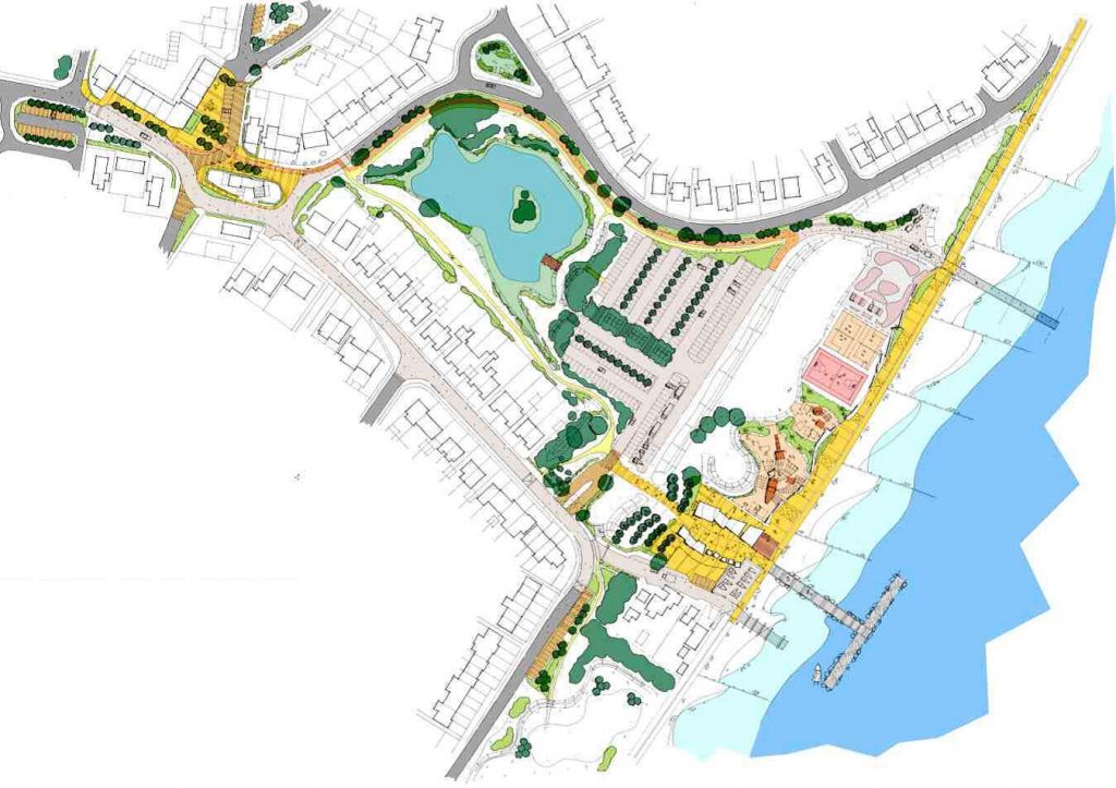

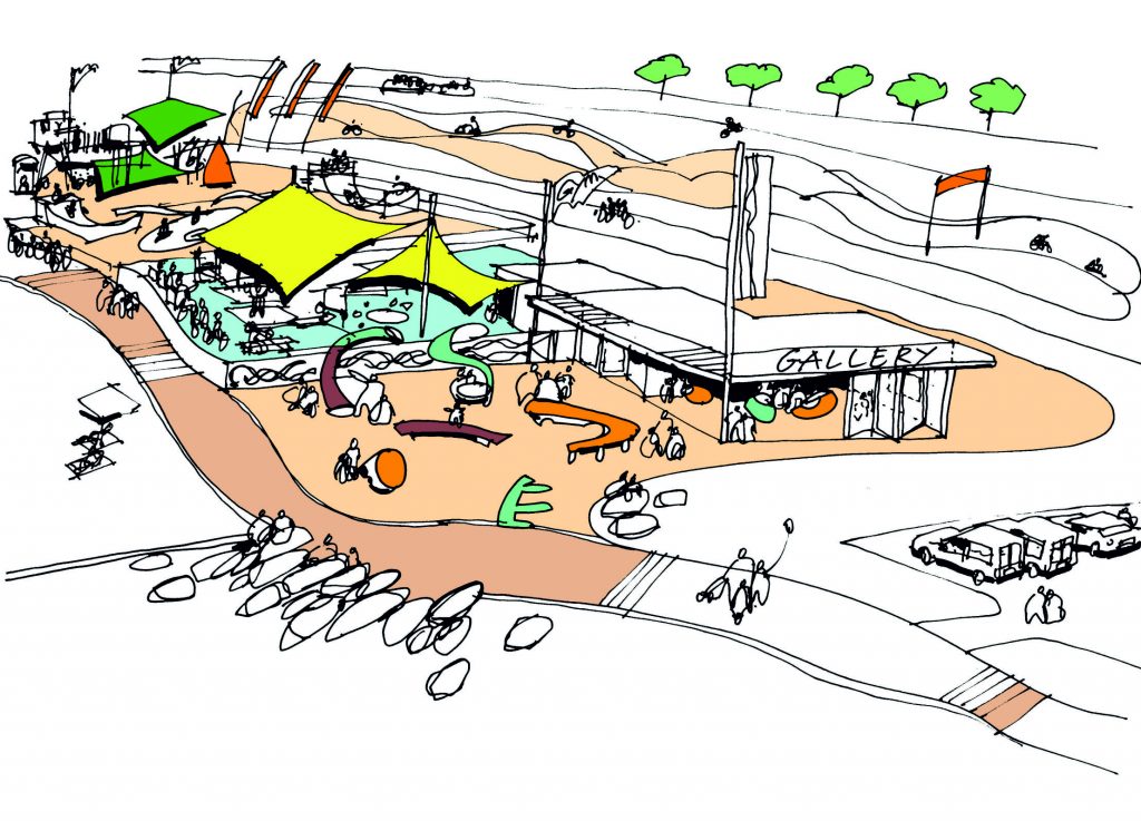
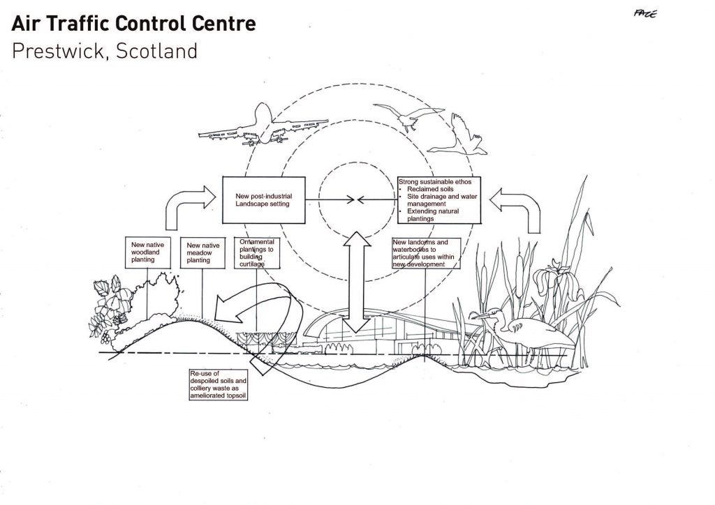
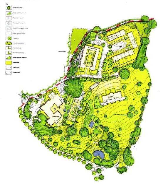
If you would like to see the full range of our graphic presentation techniques then you can download a pdf document from this link: http://we.tl/TsWose9tzc or if this expires before you get the opportunity, email me (robyn@terrafirmaconsultancy.com) and I will send you a copy……along with a photo of a drawing board if you’ve forgotten what they look like…